Improving Conversion Rate
Problem statement
When users attempt to add a new request through the application, the "DealApp" is currently dealing with a big problem with its bounce rate, which causes the application to crash. This issue is caused by the fact that users have a tough time choosing the solution that is best suited to meet their individual requirements and preferences. When the recording sessions on Smartlook are analyzed, it becomes clear that many users have difficulty with the decision-making process. This leads to a less-than-ideal user experience, which in turn leads to a high proportion of users quitting the service.
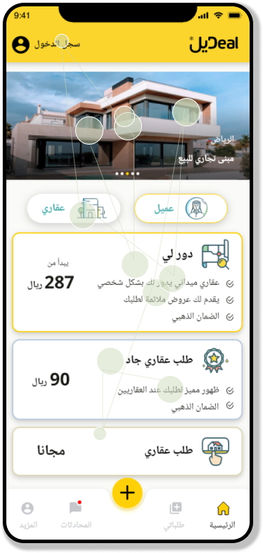
The current design of the "Add New Request" flow in the "DealApp" is confusing and does not offer consumers a clear visual hierarchy that directs them to choose the correct option. Cards representing each of these three alternatives are displayed on the main screen: new property requests, typical requests, and serious demands. Nevertheless, this layout has a number of problems, all of which contribute to the extremely high bounce rate.
To begin, the issue is made worse by the lack of adequate onboarding procedures. Confusion is caused for many users since they are not fully knowledgeable with the differences between the various options that are offered, which leads to confusion when determining which one to choose. Users are left to their own devices when there is no clear direction or explanation, which leads to hesitation and an increased likelihood of making incorrect choices or giving up on the process entirely.
Second, there is not a consistent visual hierarchy present in the current design of the home screen's layout and display of the available options. Because users do not have a clear grasp of the relative importance or relevance of each option, it is difficult for them to make a decision that is informed by all of the relevant information. The lack of a well defined visual hierarchy increases the cognitive burden and the complexity of decision-making, which ultimately discourages users from continuing with their request and causes them to leave the application.
.png)
Project Goals
- Bounce rate reduction:
is the key objective of the project, and it will be accomplished through the "Add New Request" flow in the "DealApp." The goal of the project is to increase the number of users who successfully finish the process of submitting a request by enhancing the quality of the user experience and resolving issues that prevent users from selecting the most appropriate option.
- Enhance user engagement:
One of the goals of this project is to improve user engagement by developing an interface for the "Add New Request" flow that is more intuitive and user-friendly. The goal is to capture the attention of users, inspire them to explore the available options, and urge them to complete the process of submitting a request by minimising the cognitive burden and simplifying the user experience.
- Increase the number of successful request submissions:
The project's ultimate goal is to increase the number of successful request submissions within the "DealApp." The project intends to ensure that customers can effortlessly navigate the "Add New Request" flow and effectively submit their requests by improving the user experience, reducing bounce rates, and promoting improved decision-making.


Discover
During the first phase, my primary objective was to collect as much information as possible concerning the product, the restrictions of the business, and the goals. Because of this, I was able to build insights into the competitive environment as well as a good understanding of the demands and pain points of the consumers who are the target audience for the product.
1.1 Research Goal
understand users’ Add new request process and cover problems
1.2 Eyetracking
The purpose of this user experience study is to obtain insights into the patterns of visual attention and gaze that users exhibit when navigating the "Add New Request" flow in the "DealApp." We intend to uncover usability concerns, areas of interest, and opportunities for improving the visual hierarchy and decision-making process by doing eye-tracking analyses and studying gazeplots. This will allow us to identify potential areas of improvement.
1.2.1 Methodology:
- Six volunteers were chosen to take part, each of whom exemplified a member of the user demographic that was intended for the "DealApp."
- During the course of their engagement with the "Add New Request" flow, the participants' eye movements were monitored by eye-tracking software utilising an eye-tracking tool.
- The analysis of gazeplots was carried out in order to locate fixation spots and areas of interest.
- The verbalizations and remarks made by the participants were recorded so that insights into their decision-making process could be gained.
1.2.2 Findings:
- Uncertainty Regarding Clickable Elements:
- According to the findings of an analysis of gazeplots and comments provided by participants, users had trouble determining where to click while submitting a new request.
- The participants' eyes were frequently wandering all over the screen, which suggests that there were not enough obvious focal points or prominent clickable components.
2. Lack of Visual Cues:
- Users were confused since there were no obvious signs or visual cues for the most important clickable items.
- Many respondents mentioned that they would benefit from some sort of visual hierarchy to help them focus and do the desired action.
3. Overwhelming Interface:
- Some of the participants felt the interface to be too complicated, with too many different aspects vying for their attention.
- Because of all the visual noise, it was difficult for users to zero in on the aspects that were most important and could be directly interacted with when making a new request.
1.3 User Interviews
It is a useful approach to acquire insights into users' experiences, pain spots, and issues while utilising the application to add a new request, and conducting interviews with present and potential users of the "DealApp" is a good way to accomplish this. Depending on the participants' availability and where they are located, the interviews can either take place in person, over the phone, or through video calls.
During the course of the interviews, it is vital to investigate a variety of facets that are connected to the consumers' method of decision-making. Gain an understanding of the elements that influence the decisions they make when using the app, such as the types of deals they are interested in, the desired discount levels, or any other unique criteria they evaluate. You may have a better grasp of the users' motives, interests, and expectations by delving into these elements and learning more about them.
1.3.1 Interview Recruitment
The operations team proactively reached out to six users of the application via text messages, inviting them to participate in personal interviews aimed at enhancing the overall user experience. This initiative reflects the team's dedication to gathering valuable insights directly from the users themselves, as their feedback is invaluable in shaping improvements within the application.
1.3.2 interview questions
- Can you walk me through your experience when adding a new request in the "DealApp"? What were the steps you took, and how did you feel during the process?
- When presented with the different request options (Dawarly requests, normal requests, serious requests), how did you decide which option to choose? Were there any challenges or difficulties in making that decision?
- In your opinion, what improvements or changes could be made to the "Add New Request" flow to make it more user-friendly and reduce the bounce rate? Are there any similar platforms or applications that you think handle this process well?
1.3.3 Key Findings from my interviews

.png)
.png)
1.4 Design solutions
After conducting extensive user interviews to gather first-hand information about the problems users have while navigating the app, our team has begun developing cutting-edge solutions to these problems. Our main goal is to design a user interface that improves user pleasure and usability generally, not just in the areas where users are experiencing difficulties.
By taking a user-focused approach, we've rethought our original solution to better meet the requirements of our target audience and incorporate their suggestions and criticisms into the process. The updated layout should make it simpler for users to find what they're looking for and have access to the features they need to get things done within the app.
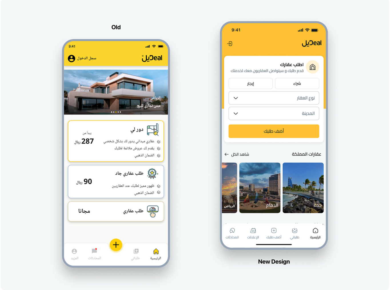
The "DealApp" homepage and the process for submitting new requests have undergone extensive redesigns. Our goal is to design a service that is both easy to use and satisfying to the people who use it. The most notable alterations to each part are summarised here.
- The app gives the user the ability to enter his request, publish it, and then display him a popup that gives him the choice to select one of the three categories of requests that we are able to accommodate.
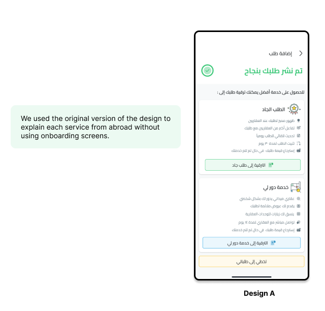
1.5 A/B Testing
the results and recommendations of A/B testing conducted to compare two different designs in add new request to boost user engagement . The testing sought to assess the efficacy of two designs: Design A, which emphasised the benefits of each service without needing user onboard, and Design B, which included an onboarding procedure for users. This paper summarises the testing approach, significant findings.
1.5.1 Methodology
- Participants: A carefully selected group of users who had recent experience with the "Add New Request" flow or expressed uncertainty in selecting appropriate elements were recruited for the testing.
- Prototypes: Interactive prototypes representing different design variations aimed at addressing users' uncertainty were created using prototyping tools.
- Moderated Interviews: One-on-one interviews were conducted with participants, during which they interacted with the prototypes and shared their thoughts, feedback, and challenges.
1.5.2 Design Versions
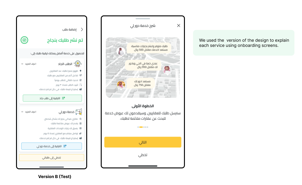
1.5.2 Findings
- Click-through Rates: Design B (Variant B) showed higher click-through rates compared to Design A (Variant A), indicating that users were more inclined to explore the onboarding process.
- Time Spent on the Page: Users spent more time on the page with Design B, suggesting that the onboarding process captured their attention and encouraged deeper exploration.
- Conversion Rates: Design B demonstrated higher conversion rates, indicating that users who went through the onboarding process were more likely to proceed further within the application.
- User Feedback: Qualitative feedback gathered during the testing revealed that Design B was favored by users due to its informative and interactive nature.
1.6 Results
- 80% An increase in the conversion rate of inactive requests into active requests in general.
- 50% An increase in the conversion rate of serious requests.
- Overall conversion rate increased from 1.50% to 1.96% during this period